Customizing mattorb.com to my taste with AI
When I wrote Farewell Ghost. Hello Astro on Cloudflare!, I ended with a section called “After basic migration, the fun began.”
That was true, but it left out most of what happened next.
The migration solved the practical problems. My posts were Markdown files in git. The site built into static files, deployed to Cloudflare, preserved the old URLs, and no longer needed a VPS with Ghost, Node, MySQL, and an operating system waiting for attention.
It was mine in the ownership sense. It was not yet completely my site.
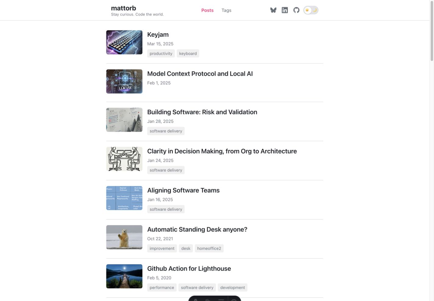
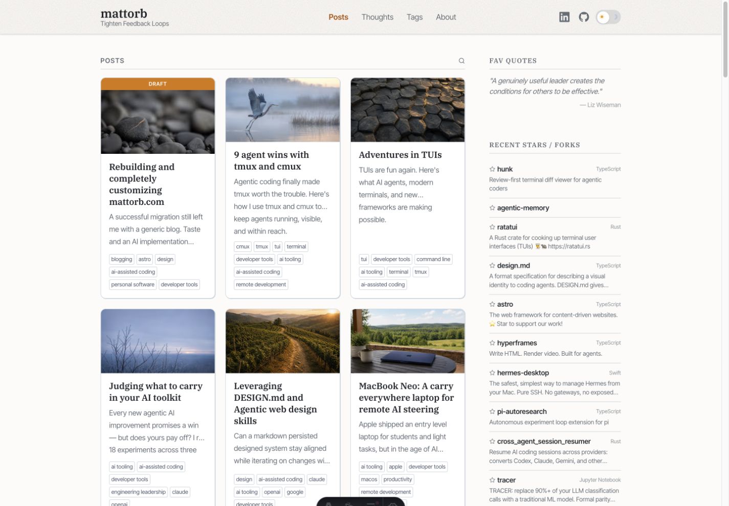
Once the whole thing was code and content in one repository, I could change almost anything. More importantly, an AI coding agent made the ROI work. I wouldn’t otherwise have spent the time to try any of these for a fun little personal blog, much less build them: a tag cloud shaped from actual rendered words, an in-browser local LLM on the About page, a publishing format for unfinished thoughts, or a header that briefly jumps to warp speed before settling into a slow star drift.
None of those are necessary blog features. That is kind of the point.
I used those features, together with a lot of quieter decisions, to turn a capable Astro site into mattorb.com. The agent could implement almost anything I threw at it. The hard part was deciding what belonged and saying no to the rest.
How the loop actually worked
My useful workflow was never one prompt asking an AI to “make this look good.”
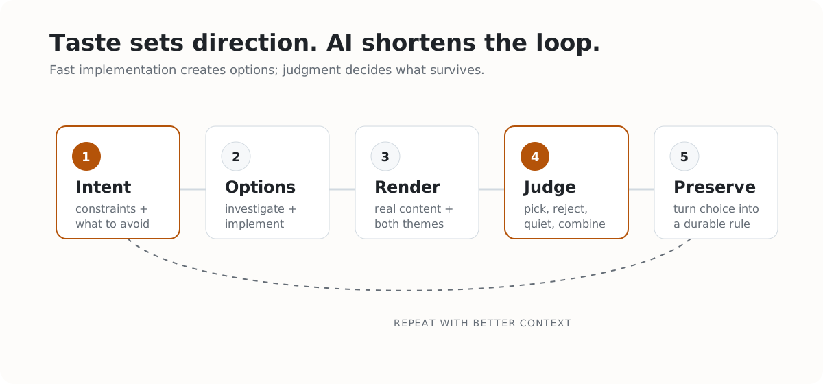
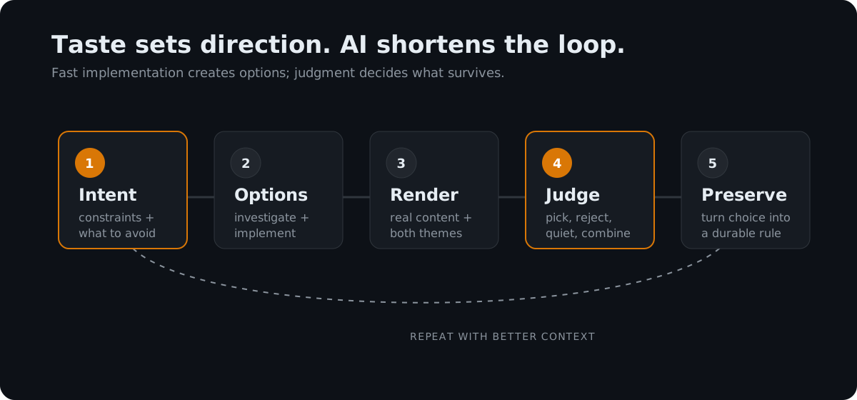
The loop looked more like this:
- I noticed something that felt generic, awkward, or underdeveloped.
- I described the intent and constraints, including what the result should not become.
- I asked an AI agent to investigate the existing implementation and propose options.
- I rendered the options in the real site, at multiple sizes and in both themes.
- I picked, rejected, combined, simplified, or asked for another round.
- I encoded the accepted decision so a future change would not casually undo it.
The agent made that loop fast. I could go from “the light header feels flat” to several implemented alternatives while I still had the problem in my head. That speed matters, but it also creates a new failure mode: when every idea is inexpensive to implement, it is easy to keep all of them.
I wrote separately about using DESIGN.md to give agents persistent design context and to compare documented decisions with the rendered implementation. That helped the site stay coherent, but the document did not choose the direction. It recorded choices after I made them.
Dark mode got stars. Light mode didn’t.


Figure 3: The same header and homepage crop in dark mode (top) and light mode (bottom).
I gave dark mode a near-black header with three layers of stars built from CSS radial gradients. On a fresh page load they briefly rush into place, then settle into a slow drift. I keep the effect in the header and remove the motion when a visitor requests it.
Putting stars on a bright background made no sense. I gave light mode a barely warm surface and fine paper grain instead, with pure-white cards just above it. I wanted each mode designed for its material rather than a symmetrical light and dark treatment.
The agent implemented the layers, tuned the animation curves, fixed seams on wide screens, and tested the preference handling. I decided the stars belonged, then kept turning them down until they felt atmospheric instead of performative.
I used typography and color to reinforce the same idea. I chose IBM Plex Serif to give headlines and the wordmark an engineering-adjacent editorial feel. I use Inter Tight for body copy and controls, where it stays out of the way, and reserve JetBrains Mono for code and small technical labels. I limited amber to links, active states, focus rings, timeline dots, and a handful of primary actions rather than washing whole sections in a “brand color.”
I eventually gave the featured images their own rules too: six photographic modes, generous negative space, a muted palette, and a rotation rule that keeps several consecutive posts from using the same visual family. AI can generate a lot of plausible images very quickly. I created the rules mostly to prevent that abundance from turning the homepage into a repetitive wall of pretty-but-interchangeable scenery.
Desktop, tablet, and phone needed different answers
Responsive design was not a final pass where I shrank the desktop layout until it stopped overflowing. Desktop, tablet, and phone each needed a different answer to the same question: what deserves the available space?
On a wide desktop, I let the homepage hold three post cards beside a 260-pixel sidebar. That density made the archive easy to scan while leaving room for the favorite quote and GitHub activity. At tablet widths, I kept that context but gave the posts one generous column beside the sidebar. On a narrow phone, I gave the navigation its own row and the post list the available width. I narrowed the sidebar at intermediate phone sizes, then moved it below the posts on the smallest screens.
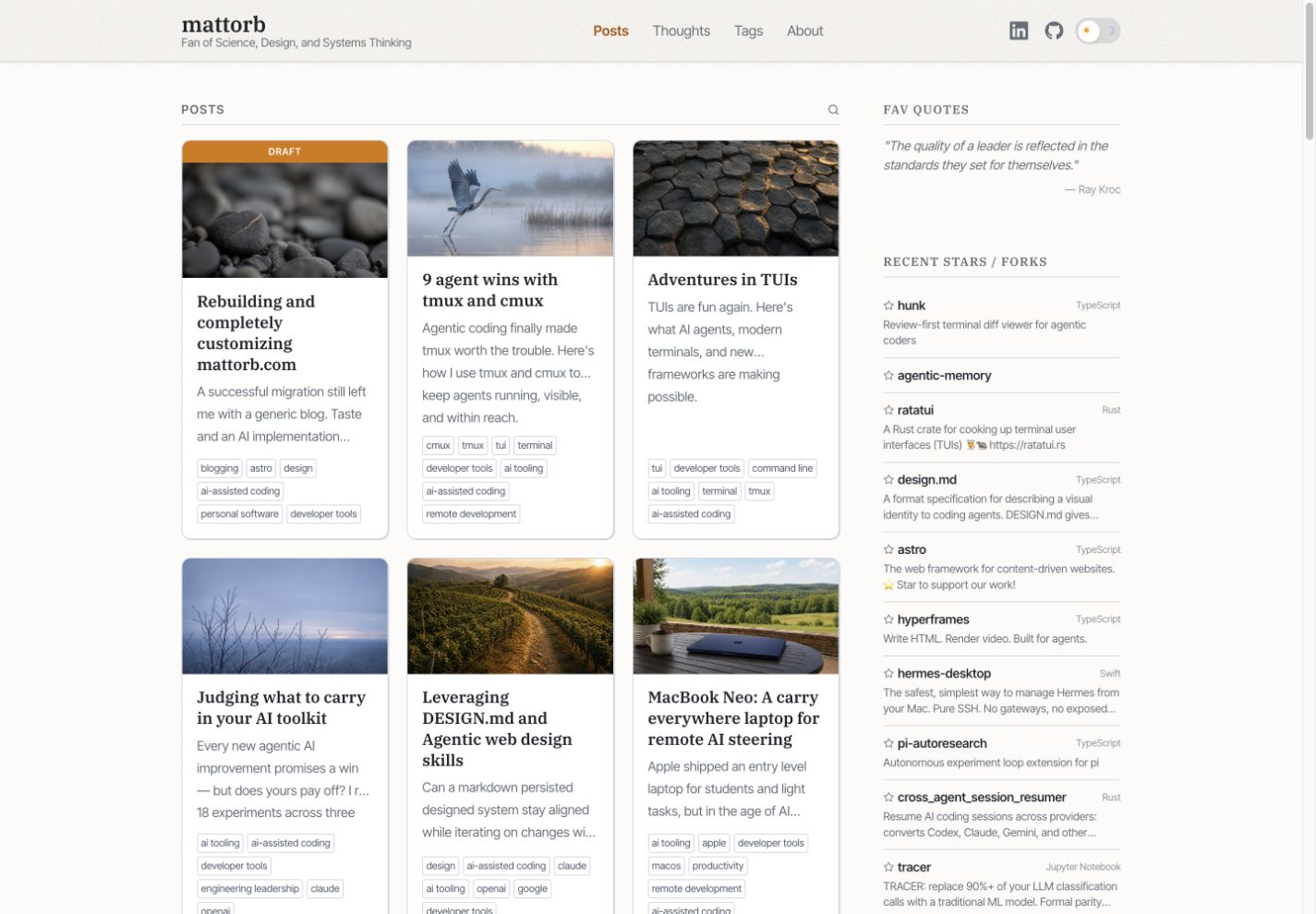
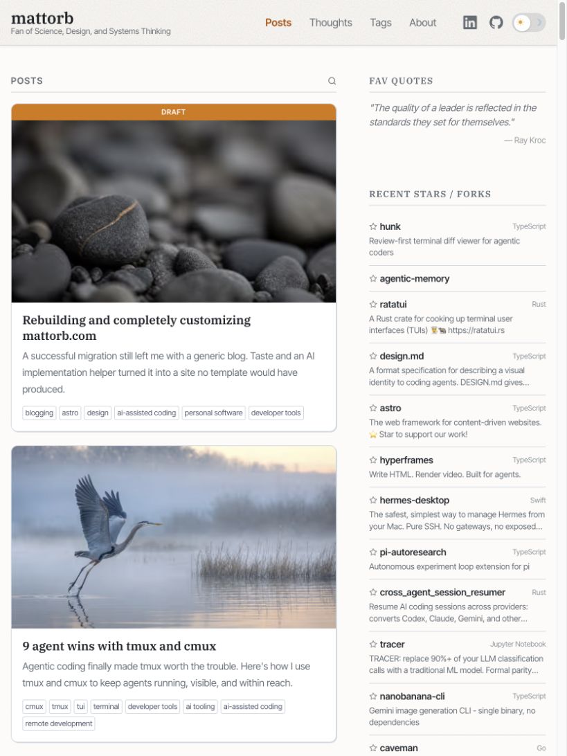
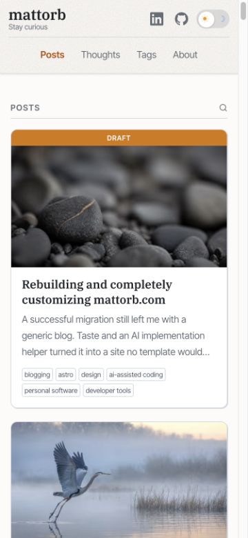
Figure 4: One homepage, three compositions. Responsive design changes priorities instead of merely changing scale.
I based those transitions on the content rather than familiar device names. I added a second post column only when the layout had room for two useful cards, the gap, and the sidebar. I added a third later. I also made the GitHub list measure itself against the post column and hide rows that would make the sidebar run longer than the content beside it.
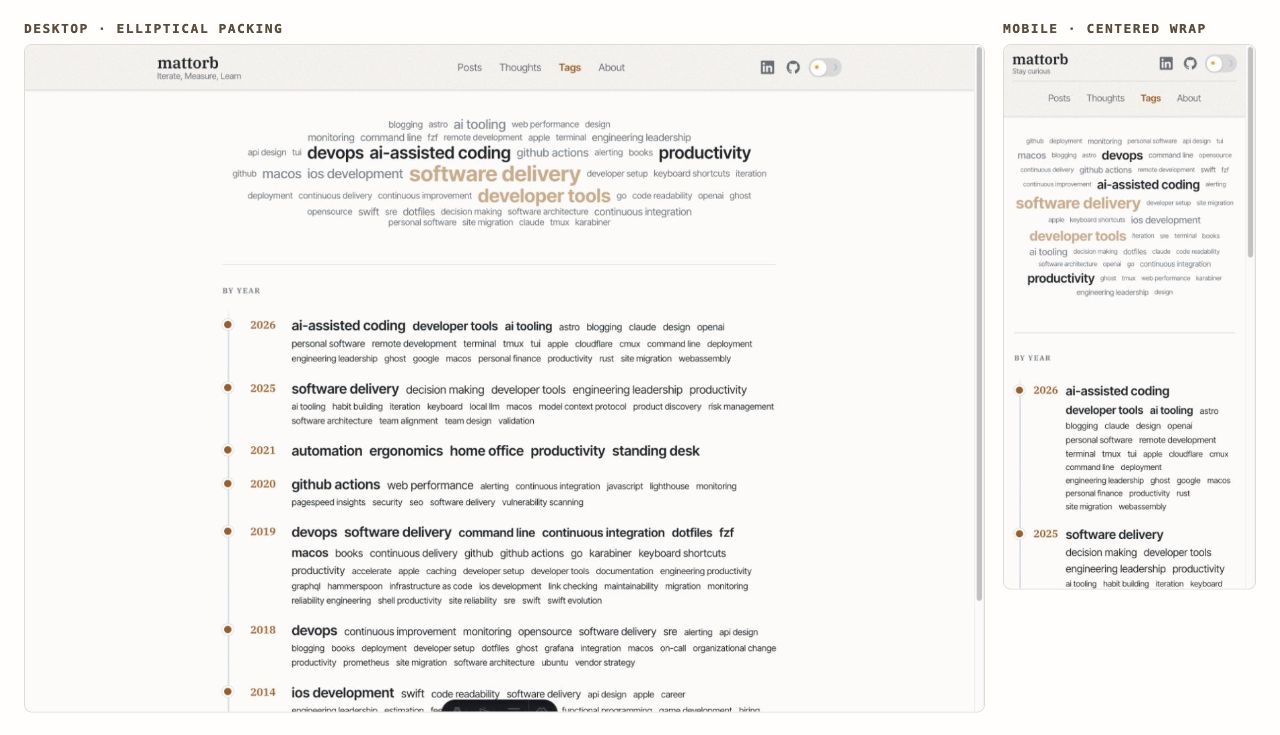
I let other pages change strategy too. I kept the weighted Tags cloud’s elliptical silhouette while there was room, then let it become a centered wrapping cloud instead of clipping words to preserve the shape. I stacked About-page cards and chat controls, returned floated figures to the reading column, and served smaller responsive image formats rather than making a phone download the desktop asset.
I wasn’t trying to make every screen match. I wanted each size to feel designed for the space it had.
Favorite quotes and recent GitHub activity
A grid of article cards is useful, but it could belong to almost anybody.
I added two quieter signals to the right side of the homepage. I have the site select one favorite quote on each visit, then show a live list of GitHub repositories I recently starred or forked. The posts show ideas I have developed far enough to publish. The sidebar shows some of the ideas and tools currently pulling on my attention.
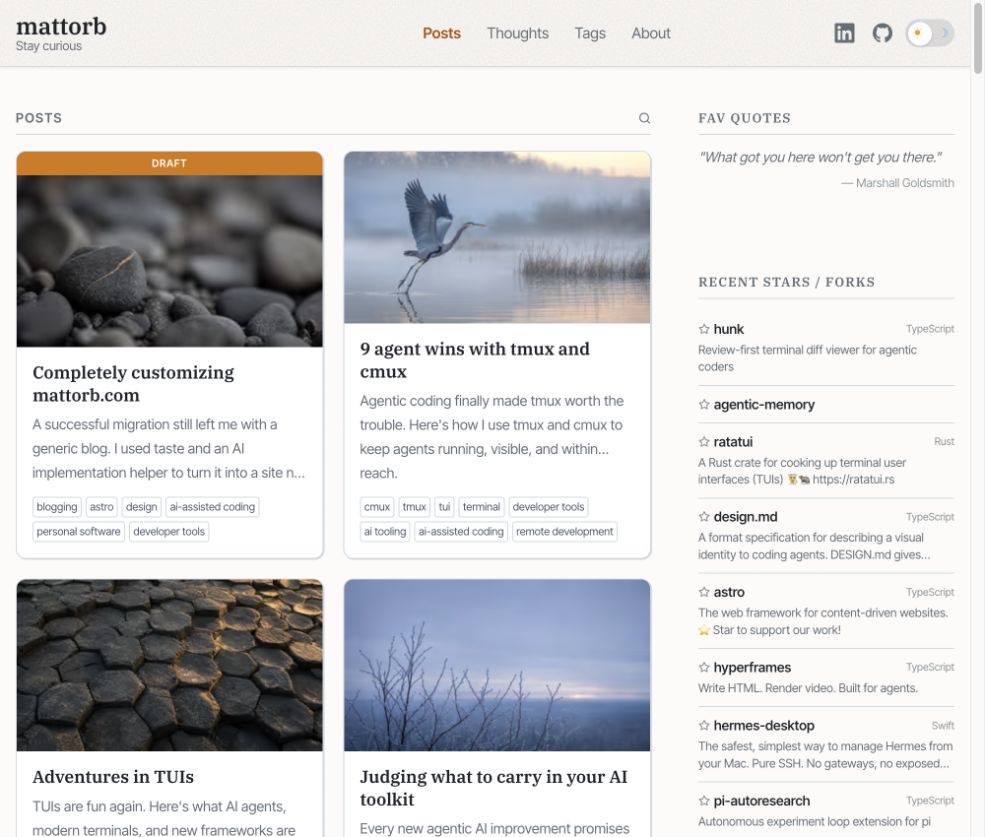
I made the GitHub component much more custom than it looks. During a build it loads recent activity from the GitHub API, removes duplicates where a fork is also starred, and falls back to a committed cache if the API is unavailable or rate limited. In the browser, it measures the post area and hides sidebar rows once they would extend beyond the article grid. At intermediate phone widths, the sidebar stays beside the cards in a narrow column; only on the smallest screens does it move below them.
That is a lot of implementation for a small stream of links. I could ask an agent to be patient with those details; I just had to care enough about the idea to keep working through the edge cases.
I made smaller choices in the main column too. I made cards lift only a couple of pixels and reveal a thin amber line on hover. I outlined tags so they do not compete with the title. I removed visible dates and reading-time decoration because I wanted the idea and its description to carry each card, not a pile of metadata.
Search inside the Posts heading
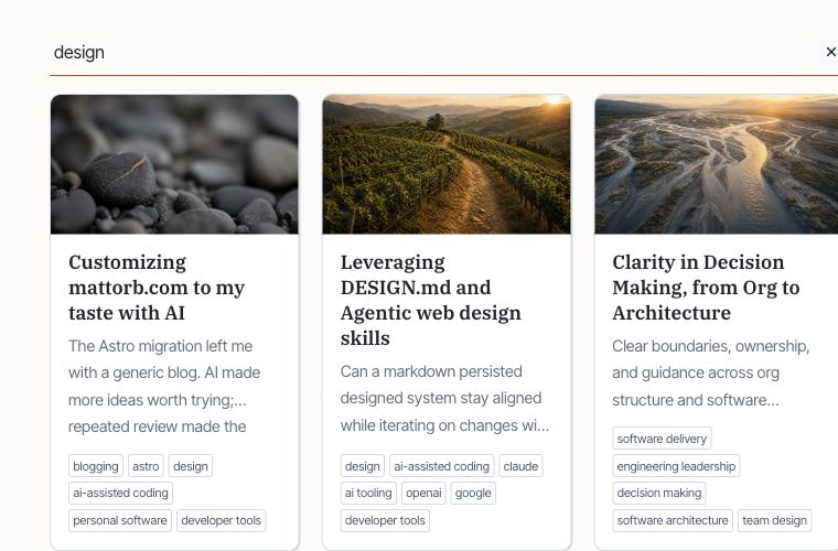
I replaced a separate /search page with a filter tucked into the “Posts” heading. It filters cards by title, description, summary, and tags entirely in the browser, then collapses out of the way when it isn’t needed.
What the Tags page shows over time
The Tags page might be the most architecturally interesting page on the site.
At the top, I turned tags with more than one post into a weighted cloud. I use frequency to control size, weight, and color, then pack the words into seven rows with an elliptical silhouette instead of dropping them into an ordinary wrapping list. Below that, I grouped the same subjects into a timeline by year and changed their emphasis within each year.
The two views make a rough history of what I was interested in.
The concept was easy for me to describe. Getting it to hold together was fiddly.
I built the server-rendered version to estimate the width of each tag and greedily pack the largest items into rows with sine-curve width targets. Once the page loads, I have JavaScript measure the real words using the real fonts and repack them. I run that work again when the browser resizes. On narrow screens, I abandon the ellipse and switch to a simple centered wrap rather than clipping words for the sake of the shape.
The git history contains several rounds of mobile cutoff, row alignment, measurement, spacing, and safety-margin fixes. I kept the shape and priorities fixed while an AI coding agent worked through the geometry.
Four perspectives on the About page
I didn’t want the About page to be only a bio or résumé.
I built the page around my own description and five principles that I keep coming back to: feedback loops, clarity, trust, whole-team systems thinking, and treating software investment as a portfolio of bets. I added a carousel of LinkedIn recommendations to bring in the perspective of people who have actually worked with me.
I built MattBot in two layers. I started with a scripted Q&A that types out a small set of useful answers rather than pretending a fixed transcript is an intelligent system. Then I added a second tab with an experimental local LLM. I let visitors choose a small model, explicitly approve a download, and run it with WebGPU entirely in the browser.
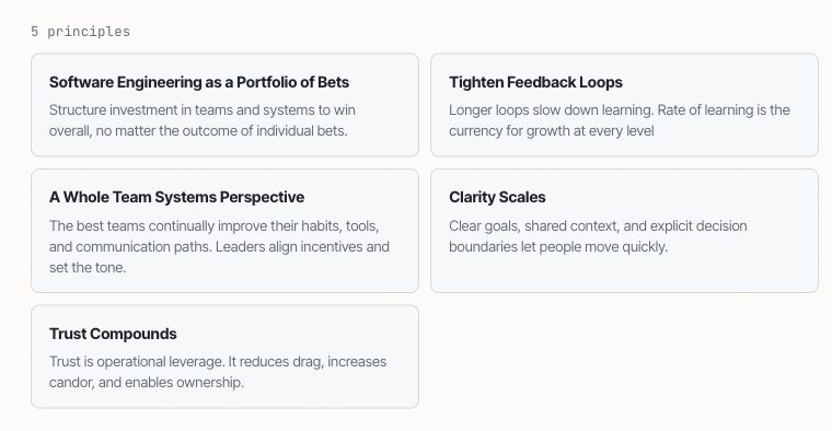
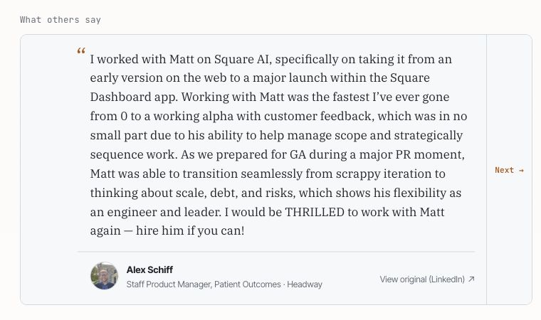
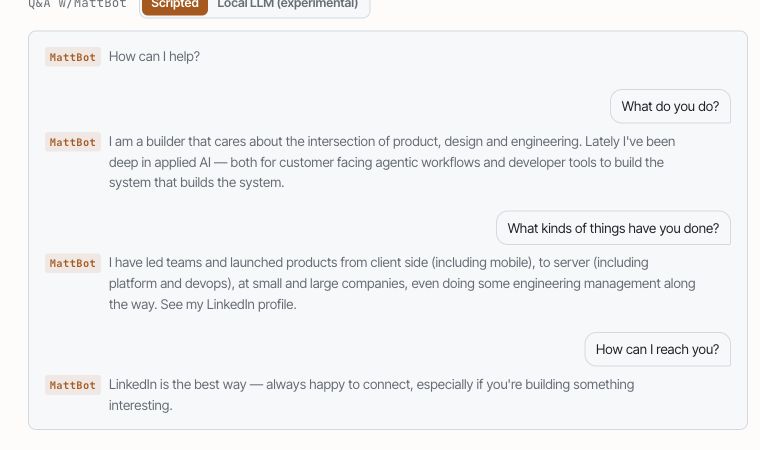
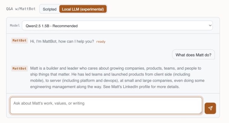
Figure 8: What I say, how I work, what others experienced, and an experimental interface grounded in the site.
During the site build, I generate the model’s context from the About page, the five principles, recurring tags, and recent representative posts. I wrote its instructions to keep it scoped to questions about me and the site, avoid inventing missing biography, and keep the answers short. I run inference in a worker so the page remains responsive.
A static personal site that can download and run its own little representative language model is gloriously unnecessary. It also connects several things I am interested in: local models, explicit context, constrained agents, and playful interfaces. That combination belongs here in a way it probably would not in a general blog theme.
I used the agent for the heavy lifting on the carousel, import pipeline, accessible tabs, model loader, streaming output, warm-up states, and error handling. I set the boundaries: the bot should feel like an experiment, not claim to be me, and not take over the page.
Thoughts: a place for unfinished ideas
Not every idea needs a full post with a title, summary, tags, related posts, featured image, and editing pass.
So I added Thoughts: short observations, experiments, questions, links, and things I am still working through. I gave them their own feed and permalinks but deliberately left out most of the ceremony of a post. I let a Thought accumulate indented “Update” sections as an experiment develops. I made images link back to the Thought permalink and turned Overcast links into rich podcast previews that load the actual player only when somebody asks to play it. I also added a dedicated RSS feed and sharing surface.
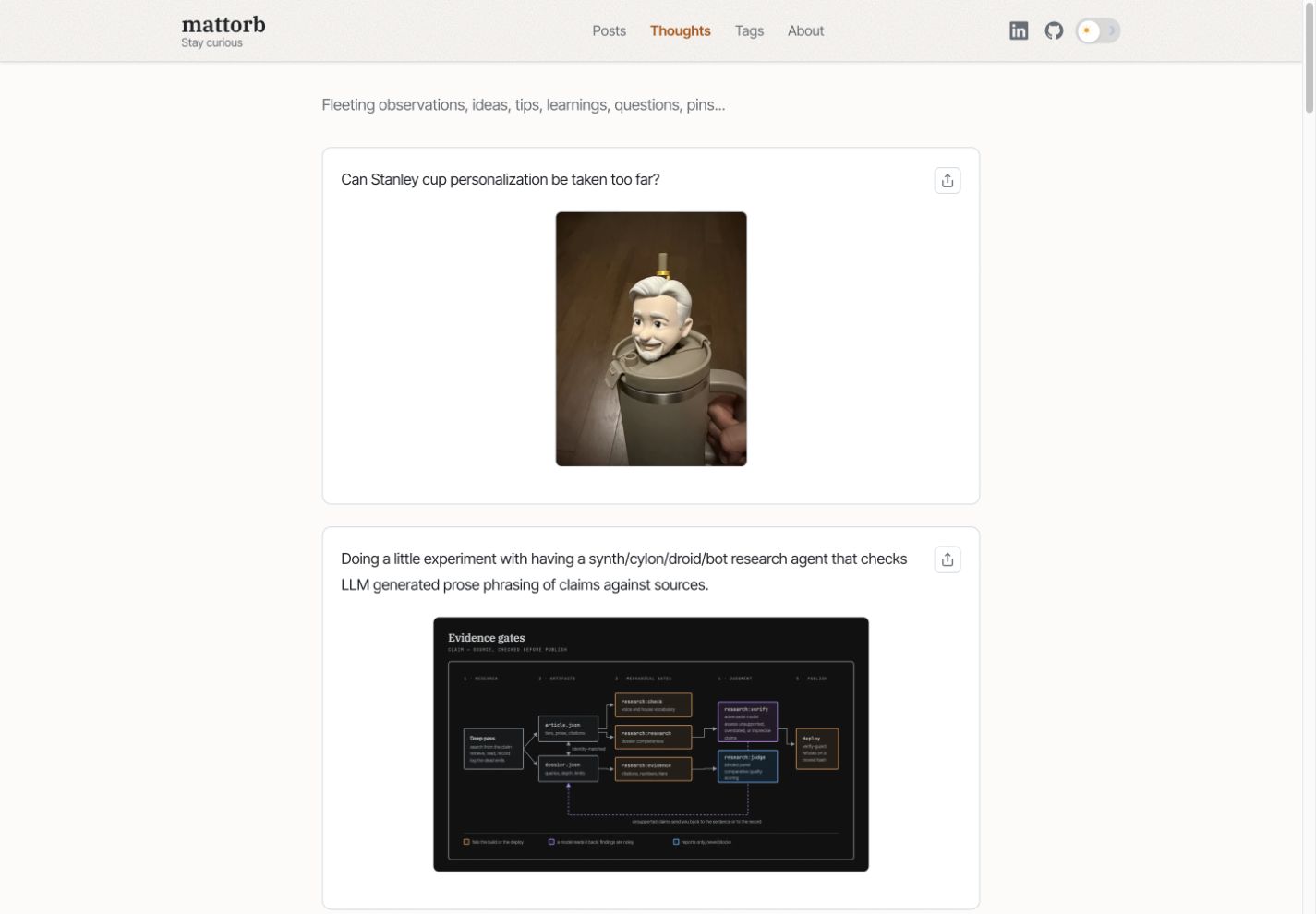
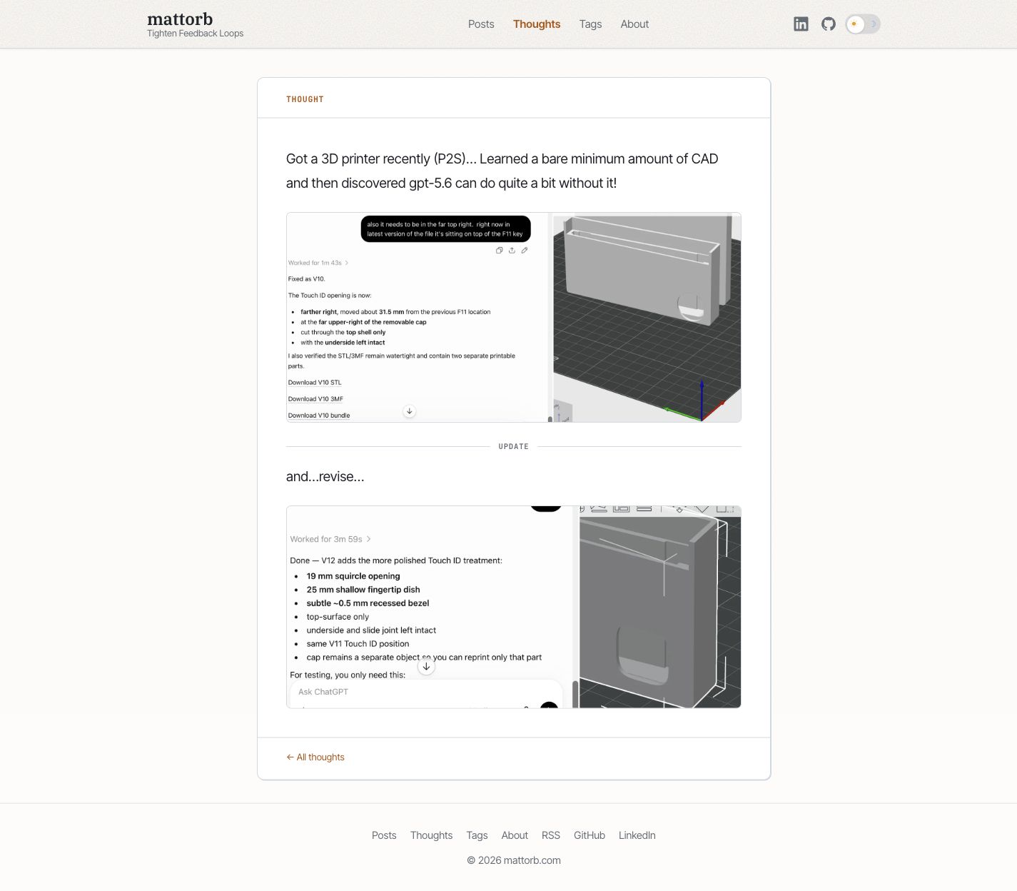
I built the share icon in those cards as the compact form of the same custom control I use on posts. It exposes the browser’s native share sheet when available, routes to X, LinkedIn, Bluesky, Hacker News, Reddit, and Threads, remembers a visitor’s Mastodon instance, and confirms copy-link actions in place. On Thoughts, I keep it to a small icon so I don’t turn the feed into a row of social buttons.
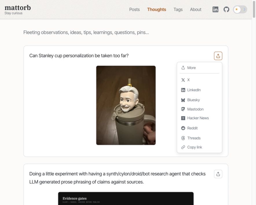
I also built a disproportionately careful publishing workflow behind that small content type. I kept Markdown as the source of truth and made site publication required, while LinkedIn and X each have an explicit choice: do nothing, create a draft, or publish now. The workflow renders destination-specific text, validates media, records immutable delivery state, and refuses to blindly retry an ambiguous external mutation.
That workflow reflects how I want to capture ideas, how I use different social destinations, and how cautious I want automation to be when “retry” might mean “publish this twice.”
The small stuff added up
The obvious custom features are fun to point at, but I also spent time on details that do not deserve their own section and still separate a template from a finished personal site:
- I tuned the self-hosted font fallbacks so a first visit does not flash and reflow when the font arrives.
- I generate responsive AVIF and WebP image variants instead of sending the same large file to every screen.
- I keep Mermaid diagram source in the repo and pre-render separate light- and dark-mode SVGs, so the browser gets a finished image instead of a diagramming runtime.
- I reduce motion when visitors request it and remove paper texture under increased-contrast preferences.
- I added keyboard and screen-reader behavior to search, theme switching, sharing, carousels, and chat tabs.
- I made the sticky header more compact after scrolling so it gives reading space back.
- I made post cards, sidebars, figures, and prose change strategy at several widths rather than merely shrink.
- I added build-time content schemas, quality gates, and draft handling to catch incomplete posts before publication.
Persisting Taste and Intent
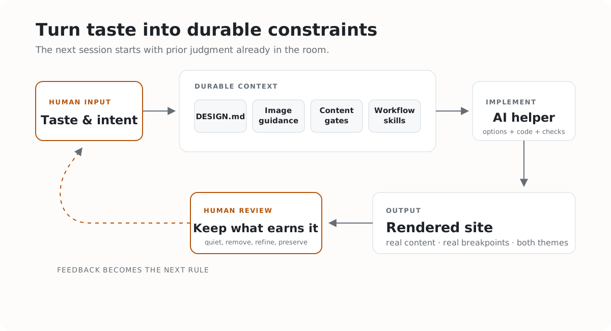
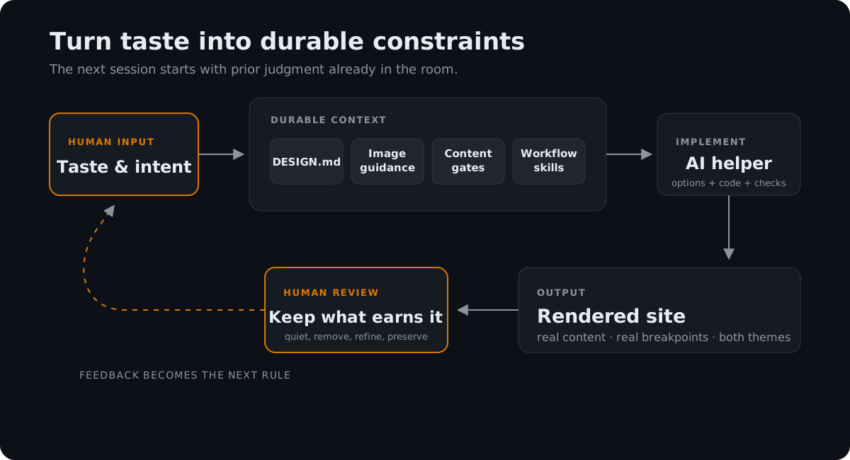
If every design or workflow decision exists only in my head, the next agent session starts from a partial picture.
I now write some of those decisions down:
DESIGN.mdrecords the visual intent along with concrete colors, typography, spacing, motion, and component rules. A development-only preview renders those rules and checks them for drift against the implementation.- Custom agent skills handle recurring workflows such as drafting, copy-editing, preparing, and publishing, with this site’s voice, frontmatter, cross-linking, and build checks baked in. Other skills handle the odd little parts of this system: choosing a featured-image mode without repeating recent visual families, syncing LinkedIn recommendations, and publishing a Thought with explicit LinkedIn and X delivery choices.
- Featured-image guidance defines several photographic modes and prevents recent posts from repeating the same scene family.
- Content schemas and quality gates encode the minimum shape of a post or Thought.
- Tests cover the especially consequential parts of social delivery and recovery.
The agent didn’t decide any of this
Before I started using AI coding agents, most of these ideas would have landed in a backlog and stayed there. They were too bespoke to find in a theme and too small to justify implementation. Once the marginal cost of trying them dropped, I could turn the site into a piece of personal software optimized for my interests, habits, and sense of fun.
That doesn’t mean I handed the site’s design to the agent.
It generated options, wrote a lot of code, handled tedious iterations, found edge cases, and shortened the time between an idea and something I could see. I still decided which ideas were worth trying, which result felt right, and which technically successful experiments didn’t earn a place.
Now that trying an idea is cheap, what weird little feature would make the app or site even more unmistakably mine?