Leveraging DESIGN.md and Agentic web design skills
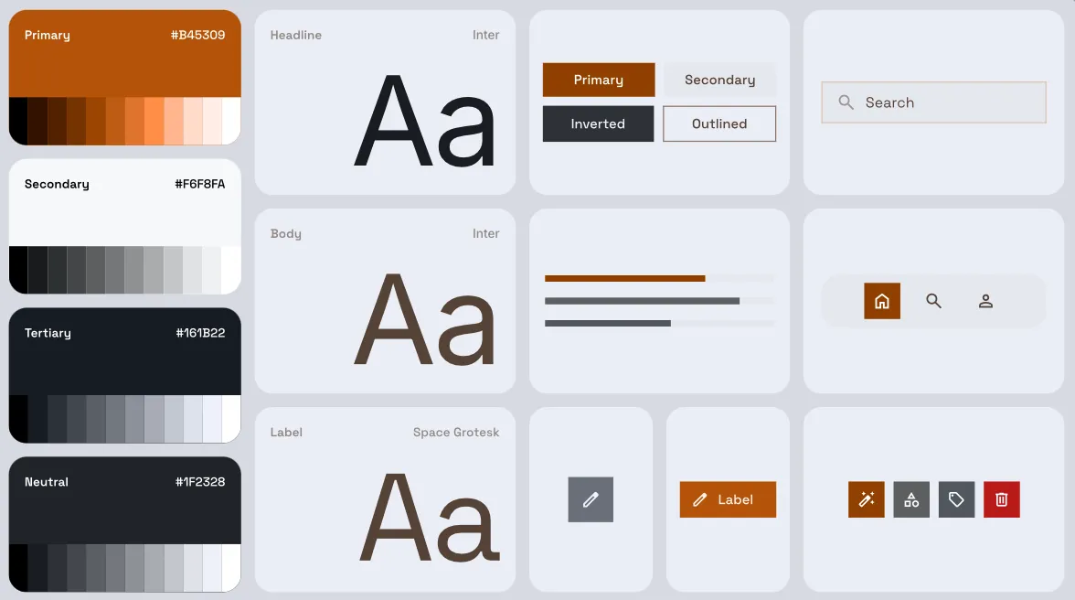
Recently, Google open-sourced DESIGN.md — an idea out of Google Labs’ Stitch project. That single Markdown file is to capture design system intent and concrete details in a structured manner that AI agents (and humans? are we still here? LOL) can use. It includes choices for colors, typography, spacing, components, and the prose reasoning tying them together.
I asked Codex to read the source code of this blog and produce a DESIGN.md.
The recommended prompt I used was:
Analyze the design system of this codebase with the goal of creating a `DESIGN.md` file in the project root and giving the user a
  file for easy copy & pasting.

  Reference material:
    Overview : https://stitch.withgoogle.com/docs/design-md/overview/
    Format   : https://stitch.withgoogle.com/docs/design-md/format/
    Spec     : https://github.com/google-labs-code/design.md

  Examples from the spec repo:
    https://github.com/google-labs-code/design.md/blob/main/examples/atmospheric-glass/DESIGN.md
    https://github.com/google-labs-code/design.md/blob/main/examples/paws-and-paths/DESIGN.md

  Requirements:
  - Begin with YAML frontmatter containing all structured design tokens
    (colors, typography, spacing, elevation, motion, radii, shadows, etc.)
  - Follow with free-form Markdown that describes the look & feel and
    captures design intent that token values alone cannot convey
  - The file must be entirely self-contained — do not reference any
    files, variables, or paths from the codebase
  - All token values must use valid YAML design token format

  If you have access to a running local server or screenshots of the
  product, compare your DESIGN.md against the rendered UI. Revise until
  both the YAML tokens and the written description faithfully capture
  the product's visual identity.
It was a short hop to render my own live preview page for it — every color swatch, type sample, radius, shadow, and component spec on a single page, in the actual fonts and colors the site uses.
At this point, I thought “How can I keep this accurate over time?” and decided to see if Claude could generate a preview page with a drift detector. So I asked it, and it did. The same parser that renders the preview also walks the rendered styles and compares every token in DESIGN.md against what the browser actually computes into CSS styles — colors, shadows, typography.
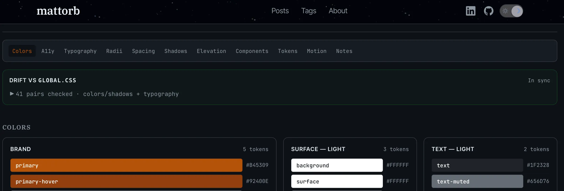
Important
That drift check (“Drift vs Global.css” in screenshot above) is an unlock. A design system that exists only as prose and commentary can easily go out of sync.
Now, I (or an agent) can quickly open the preview to see if a design change introduced drift. That drift check could be automated to fail a build/deploy/etc. Small tool, big leverage and I would never have spent time to write it for my fun little blog, without AI speeding things up.
Asking Claude to come up with improvements
Next, I installed Claude’s frontend-design skill so the conversation could shift from understanding what is there, to thinking through what could be improved. In Claude Code that’s two slash commands:
/plugin           # browse the official marketplace, install frontend-design
/reload-plugins   # activate the new skill
With DESIGN.md in place and the skill loaded, the critique was a single prompt:
/frontend-design:frontend-design Evaluate the current design choices of this site, to make recommendations. Design system/intent is documented in DESIGN.md, but look at the site overall, and identify areas we could improve. Build a DESIGN_IMPROVEMENT_PLAN.md file with options for us to prioritize and decide which ones to action.With DESIGN.md as the shared reference, the conversation was specific from the first reply. There was no “what should we even use as the brand color?” — that was already on the page, and reasoning for visual tone was also spelled out as intentional.
It had a lot of ideas.
Some of those most salient ones were:
- The light mode site header, which does not make sense to show parallax star field on, needed some subtle improvement.
- Headlines and typography could use improving.
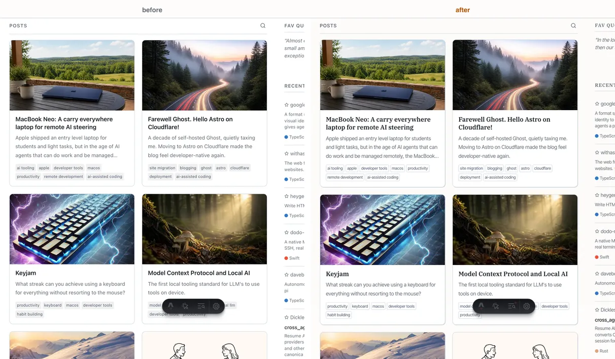
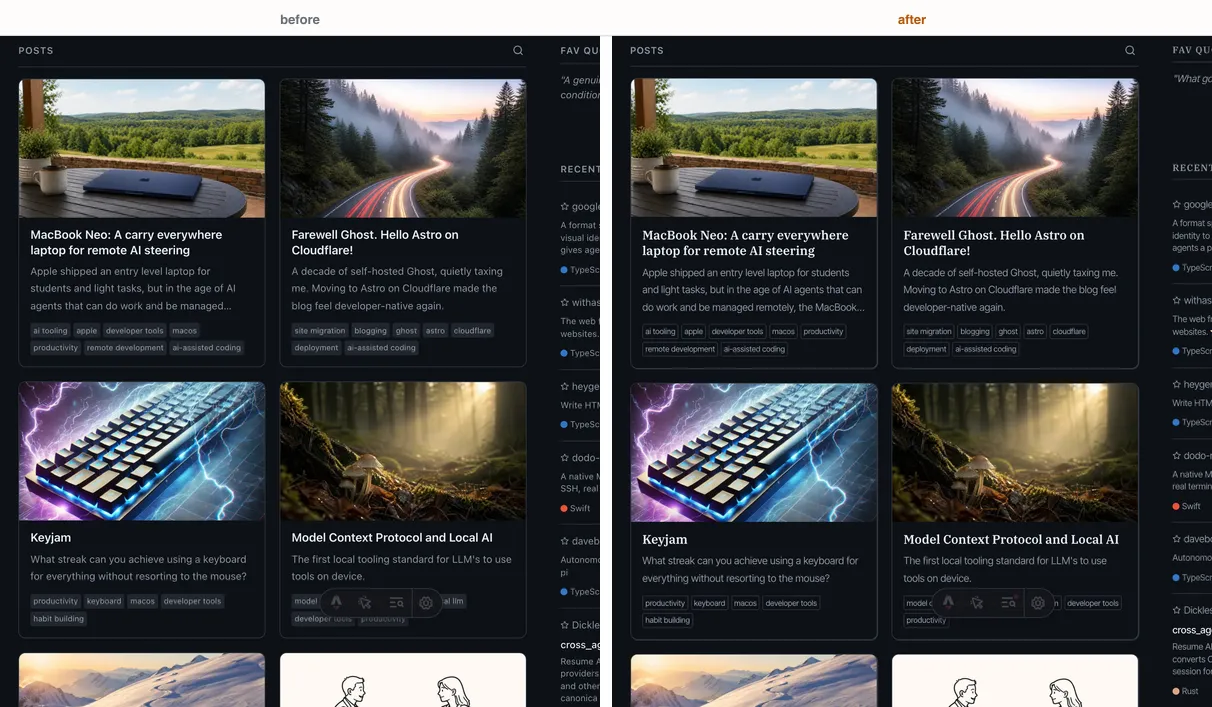
- The post cards on the homepage could be improved.
- The tags page was actually the most architecturally interesting page on the site, but it was undersold visually.
I picked those four things to act on, hammered out the plan, and sent it on a mission. Anywhere there was not an obvious winner to me, I asked it to generate mockups of the options so I can make a judgement call.
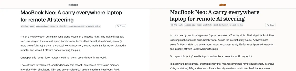
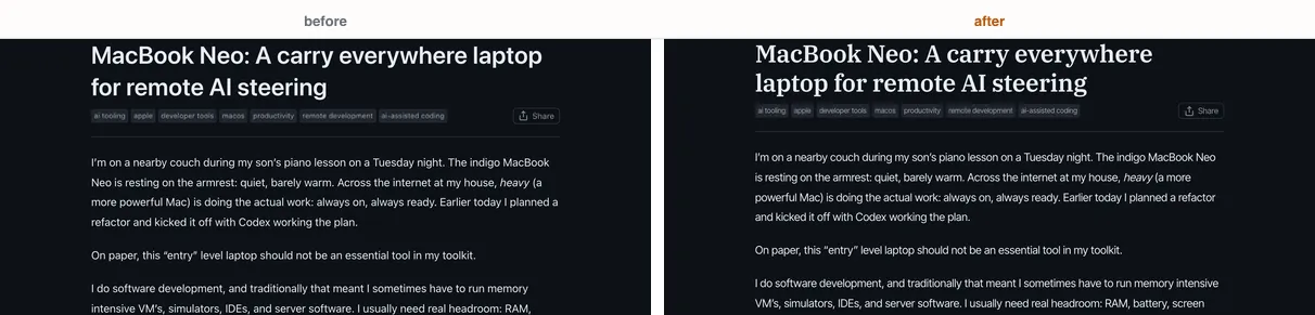
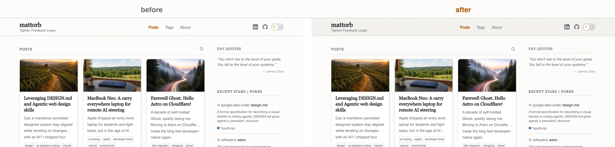
Here are some before and after screenshots:
Typography
Light mode header warmth
The dark mode site header already had a signature: a slow drift of stars across. Light mode had nothing — it was a stark white background. So I added a barely-warm page color and a fine paper grain that you feel more than you see.
Post cards on the home page
Each card now has a thin offset shadow and on hover, the card lifts off the page. Tag chips on the cards lost their gray fills; they are outlined now, to de-emphasize relative to the title and description above them.
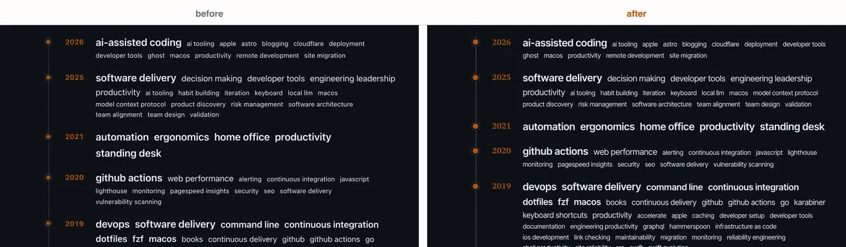
Tags timeline
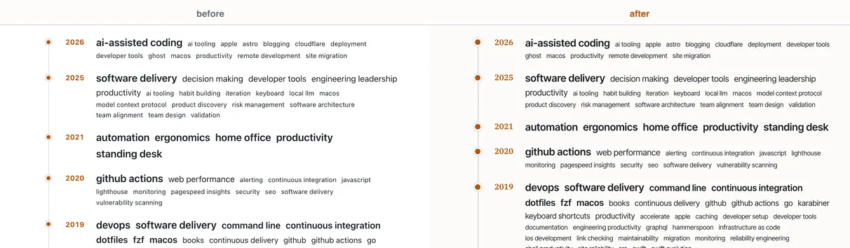
The Tags page was already doing something interesting: a weighted cloud of every tag at the top, then a year-grouped timeline of the tags that defined each year.
Made some small improvements to the timeline rendering like a slightly thicker rail, bigger dots, year labels in the new serif. None of it is dramatic; together they let the page read as deliberate rather than templated.
Fin
Changes seemed to go smoothly, and I suspect having that DESIGN.md in the mix providing guidance, definitions, and guardrails helped. Every change had a place to land in the code, and could be checked against the intent of that document. The design system and the rendered site stayed consistent.
Neat!